Uovonero
2016
We elevated the egg to new heights crafting a sophisticated brand.
role & services
Branding, logo design, packaging
credits
photography:
client
Uovonero
Approach
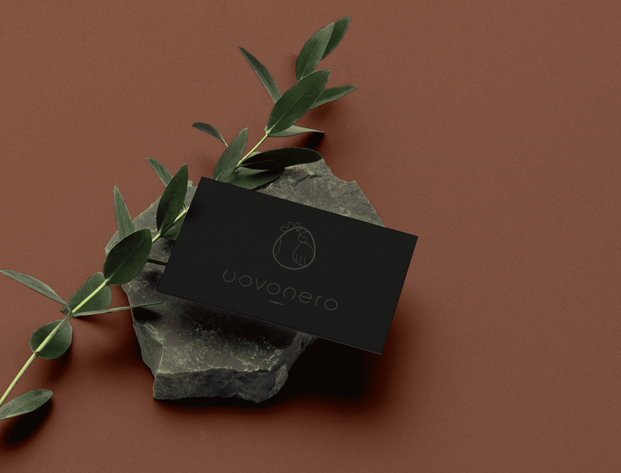
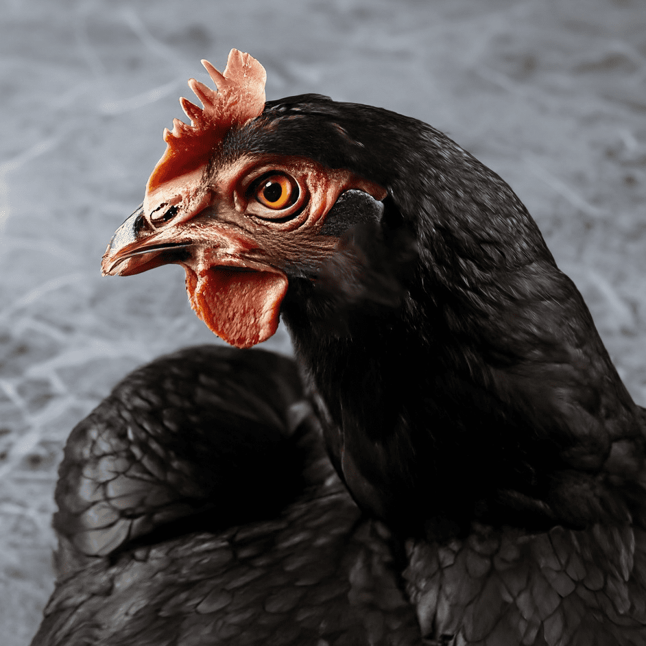
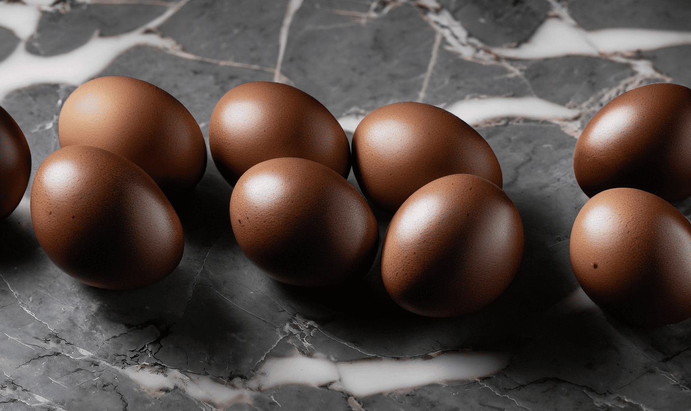
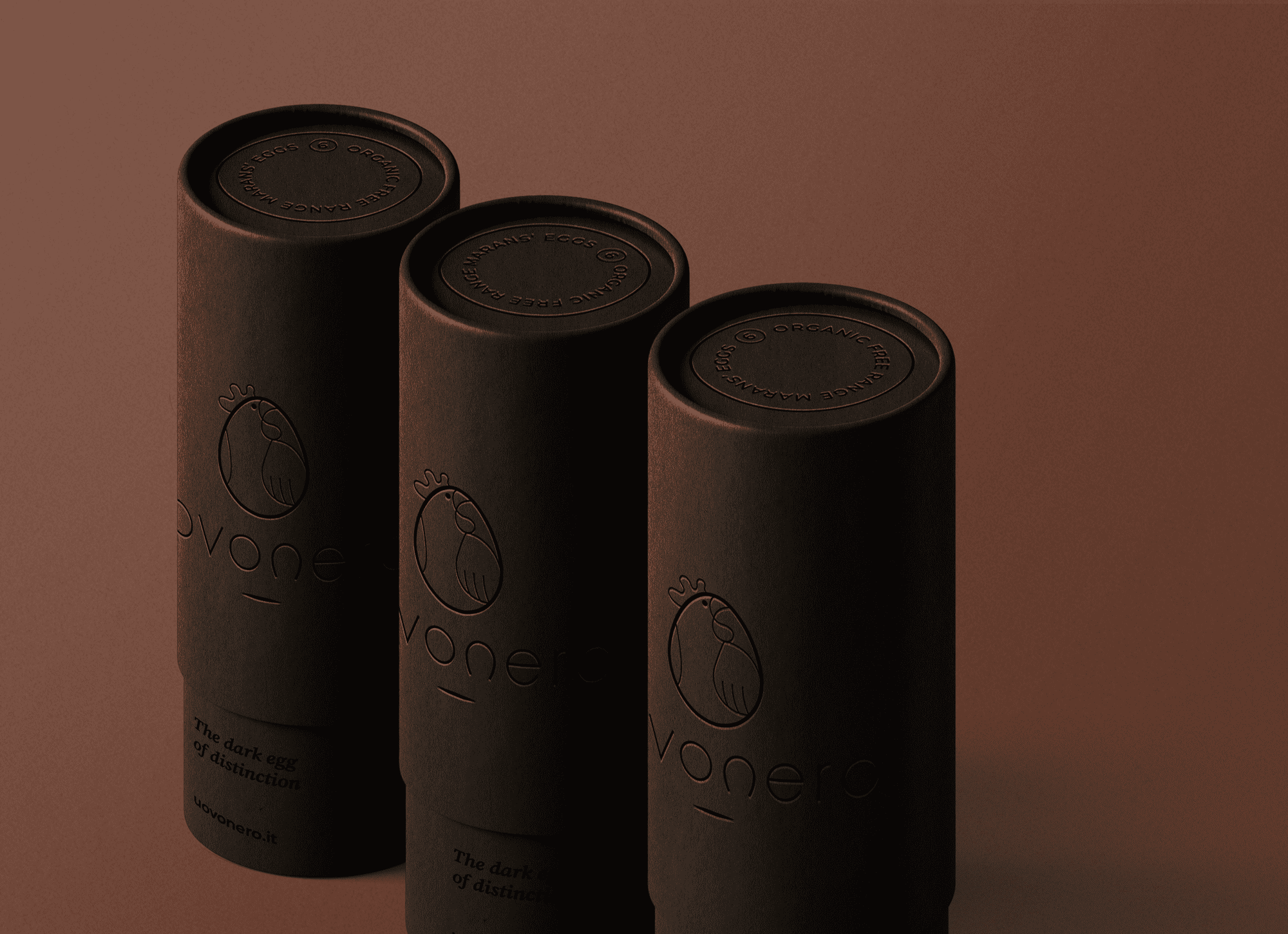
Uovonero is a Marans egg brand embodying minimalism and sophistication. Our project encompasses the creation of a distinctive logo, custom typography, and captivating packaging design. The essence of Uovonero lies in its name, which translates to “black egg,” inspired by the rich pigmentation of Marans eggs.
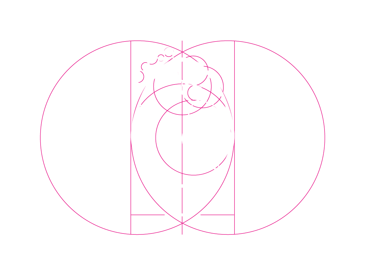
Logo
Uovonero’s logo features a flawless egg silhouette cradling a subtly depicted hen, echoing the timeless question, “What came first: the chicken or the egg?”
Packaging
The design ethos revolves around a minimalist aesthetic, where elegance is accentuated by a delicate white outline against a sleek black backdrop.
branding
The typography is crafted using the organic curves of the egg, epitomizing the essence of Uovonero.
